Reflections from review 5.
8th October 2012
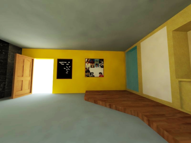
I showed the last two weeks progress – which was logo iterations, Sketchup model & Presentation.
Points to work on –
1. Edit text. Make it more brief, get the point across with lesser words. Cut the clutter.
2. Use the identity in the language be more about navigation – drive, path, navigate etc
3. Look at use of colour in presentation-simplify existing use. Could use the colours of the logo – purple + yellow throughout the presentation to create a more last impact
of identity/idea through presentation itself.
4. Personas page – same view of of illustration/ think about using photograph.
Could categorise information more with headings like pain point, background.
Ground persona more- give more facts.eg- where he lives etc.
5. The scenarios could work better as story boards.
6. See how logo works in reverse format- on a dark background.
7. Listening/knowing- could be one category.
8. PDF- ppt- print ready file.
9. Beginning of presentation needs a brief overview of Navgati.
Who, What- Students/ITI/Quest- to anchor presentation.
10. Sketch up model + presentation synchronization.
Some parts need to be explained of the room.
11. Sketch up model – rendered with people.


